A little oak leaf
Obverse

Following the dissolution of the Ottoman Empire after WWI, the land was split into a number of countries. The north-western part of the former empire became Turkey. The Ottoman capital Constantinople became the Turkish capital and was renamed Istanbul in 1930. I wrote a little more on the capital in the piece on the Byzantine Follis, minted in the same city over 1,400 years earlier.
The text around the edge, “TÜRKİYE CUMHURİYETİ” translates to “Republic of Turkey”. In 2021, the government of the country started a push to be officially known as Türkiye around the world. Note, I have left the country name as “Turkey” for this coin as that was what the country was known by at the time it was issued. It is also how this coin is identified in numismatic references.
The central part of the obverse design is the star and crescent, which comes from the flag of the country. On the flag, the design is the other way around (Crescent on the left, star on the right. Up until the early 1980s the design was this way around on Turkish coins, and on more modern coins, the design matches the flag. If anyone knows why, please comment below!
Reverse
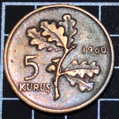
The reverse of the coin features the denomination and the year. The central design is an oak branch. The oak is a symbol of strength, longevity, and endurance. The young branch represents youth and growing. It reminded me of several other coins featuring oak leaves or branches:
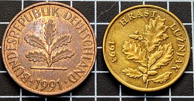
Left here: The German 2 Pfennig coin (1969-2001) features a young oak leaf as a symbol of regrowth after WWII.
Right: The Croatian 5 Lipa (1994-2022). Again, the oak for the newly independent country symbolises youth and growth.
Turkey used the same design on its 5 Kuruş coin from 1958 to 1977 when the denomination ceased being issued. In 1975 the composition changed from bronze to aluminium.
Leave a Reply